Watercolors + Architectural Design
Watercolors + Architectural Design


Watercolor sketching—capturing ideas or the immediate surroundings in line and color—can help architects advance their designs. Whether using a pencil, pen, tablet, or other implement it is helpful to start with a partially baked idea and let the remaining “cooking,” or development of the idea, happen while sketching. Similar to a cookie that is removed from the oven to finish baking on the stove top, the design idea benefits from being removed from the designer’s head and aired out on a canvas. The following sketches and reflections explore the advantages of using watercolor as a medium for airing out our design ideas.

Starting a sketch knowing that the idea doesn’t need to be fully figured out in advance can be liberating. I feel excitement as I take out my paper and supplies; like a scientist setting up an experiment, I may have a hypothesis but am not yet sure where the investigation will lead. This wait-and-see approach raises the value of sketching from simply a way to communicate an already developed idea to an integral component of architectural design and therefore a valuable skill for designers to cultivate.


Design sketching is even more critical now, when architectural renderings are typically contracted out to professional rendering companies rather than completed in-house by the architectural design team. The contracting out of realistic renderings frees the architectural designer to sketch for purposes that have a greater impact on a structure’s design. The collages of plans, elevations, and perspectives shown above were studies suggesting various materials and textures for an outdoor café and how the client’s art collection could be integrated into a grand stair gallery decorating the approach to the café. The watercolor washes added to the pencil sketches utilized warm and cool colors, shadows, and depictions of materiality to help the viewer feel what it might be like to be in those spaces.

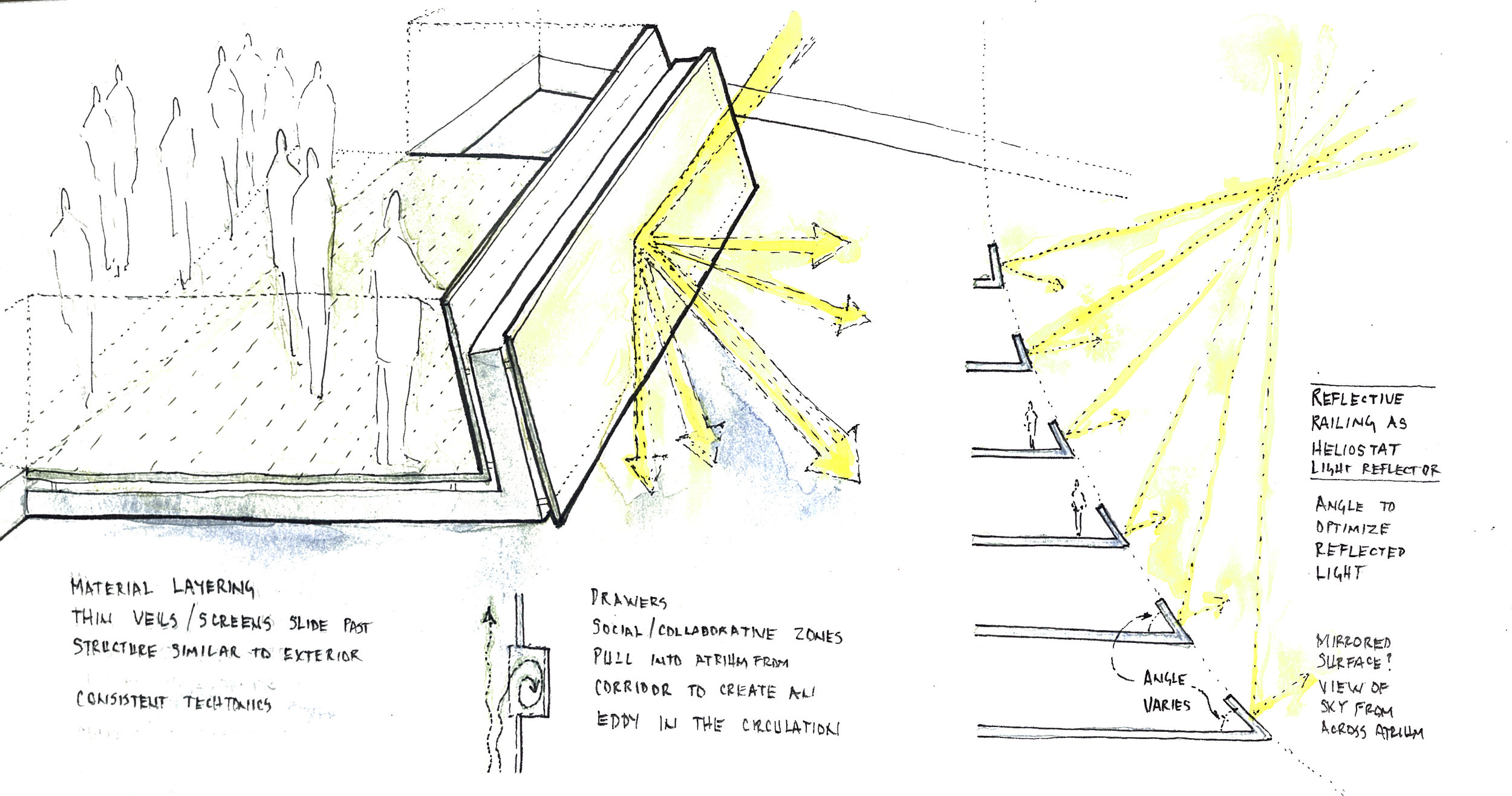
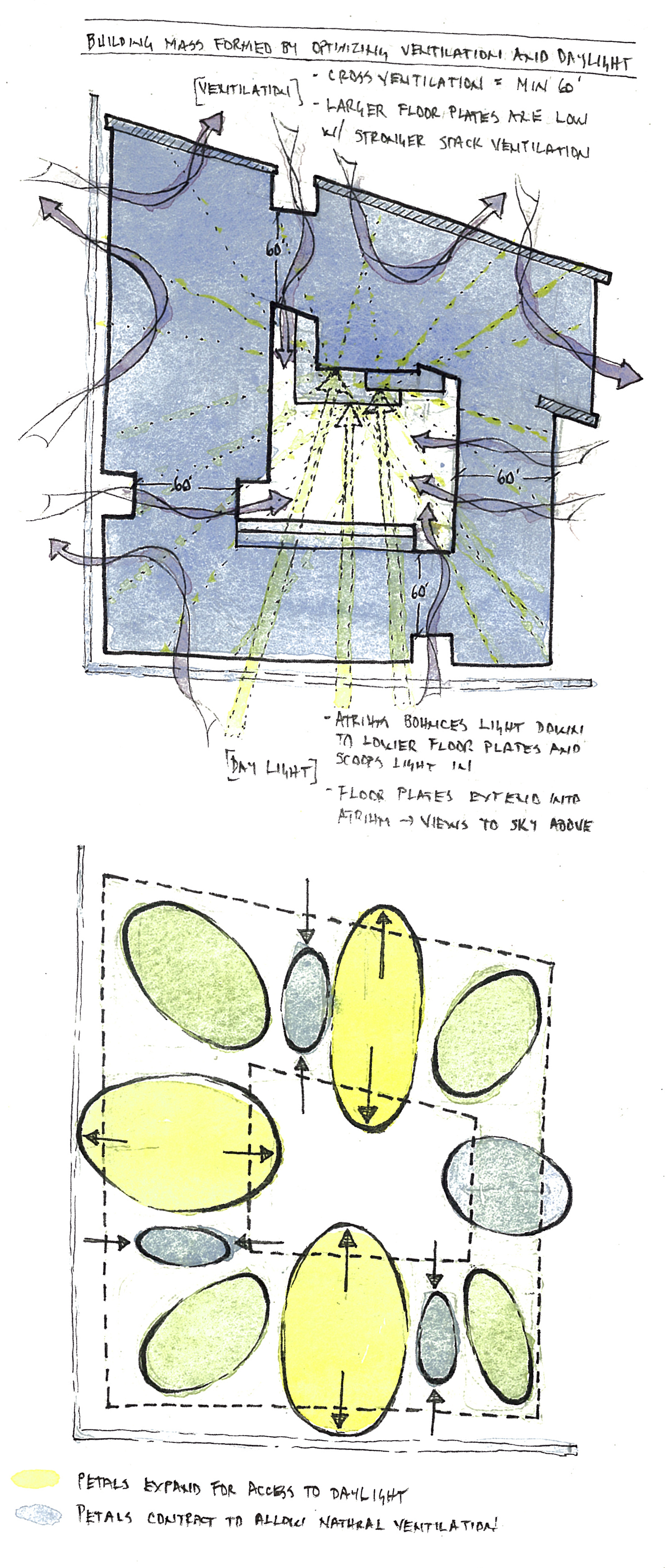
Design sketching with watercolor washes can be both informative and illustrative. The example shown above was a design study for improving natural daylight and ventilation by carving a reflective light well into the center of a building and using a “stack effect” to passively draw air up through the thermal chimney. It reveals how, rather than drawing a realistic view of how the light well might look, which is best produced by a professional rendering company, a designer can instead collage text and arrows onto a section perspective view. This watercolor sketch informs by showing how the angled reflective surfaces and operable louvers could function for improving daylighting and energy efficiency; it illustrates by showing the warm colors in the light shaft and people gathered nearby, thus helping the viewer experience the benefits of the light shaft.
More importantly, the design of the light well evolved while the sketch was being made. The back wall of the shaft became sloped and covered with a reflective material, improving views and daylighting. Also, the bottom of the shaft opened up to the main public level below, offering people walking beneath it a unique perspective with colored light and views that would change as the sun arced through the sky above the passing clouds.

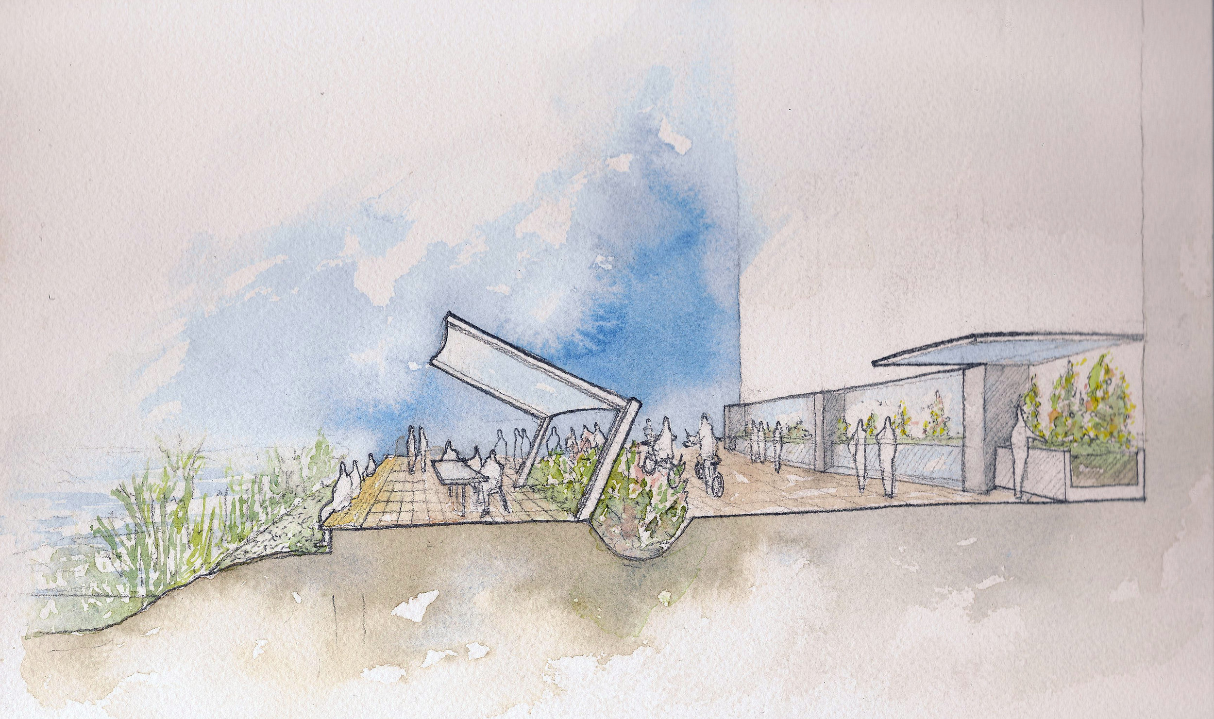
This study began as an idea of a living wall that extends several stories of an atrium, with conference rooms and break-out areas suspended like platforms on each level. The plans and section of this idea were sketched in pencil, then the application of watercolors highlighted an additional design concept: the green roof folded down to become the living wall, achieving the client’s goal of bringing the outside in. Selecting the areas to receive color in a sketch invites an architectural designer to emphasize particular ideas and relationships. The resulting sketch, freed from having to be a realistic rendering, can then more clearly diagram the design intent.

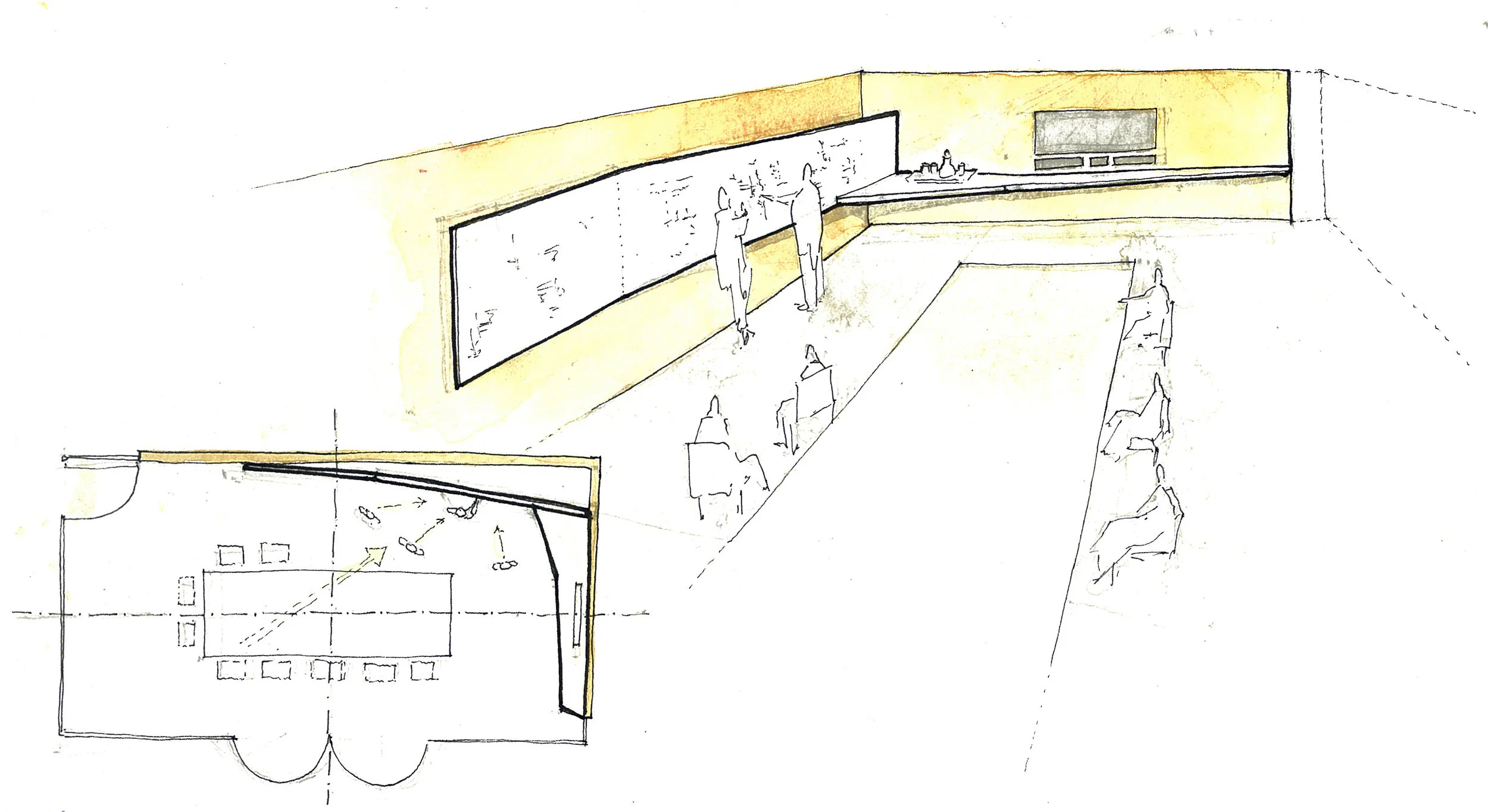
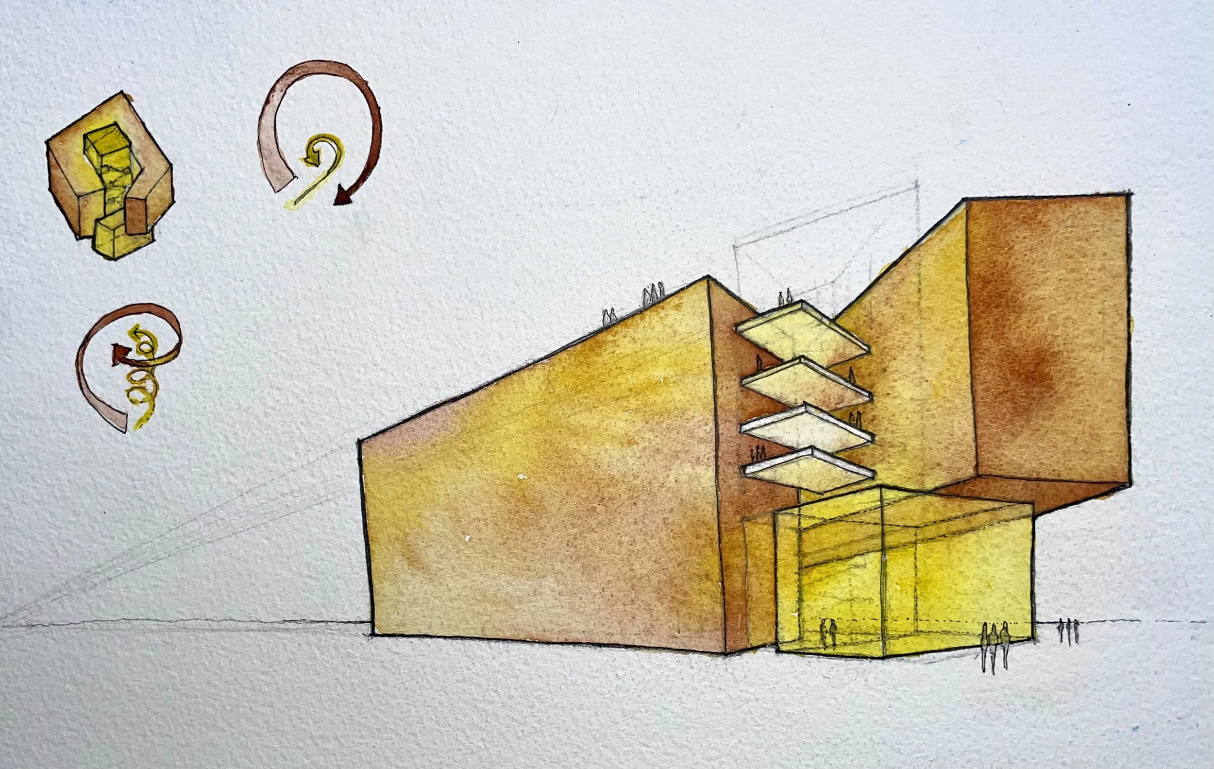
The design concept for the preceding sketch was to have the main public stair of the building appear “carved out of the earth” at the basement level and then “suspended in the air” at the upper levels. As opposed to the previous sketch, where the selective placement of color was used to highlight the design idea (folding planes of planted areas), in this sketch the saturation of color was used to support the design idea: the greatest contrast in saturation, the darkest dark near lightest light, is how the upper stair evokes feelings of floating while the reduced contrast in saturation characterizing the lower stair reinforces the idea that it is carved from materials similar to those embedded in the ground. This simple strategy for creating spatial depth is implemented more effectively through color saturation than through line weight from pencil and pen sketches.
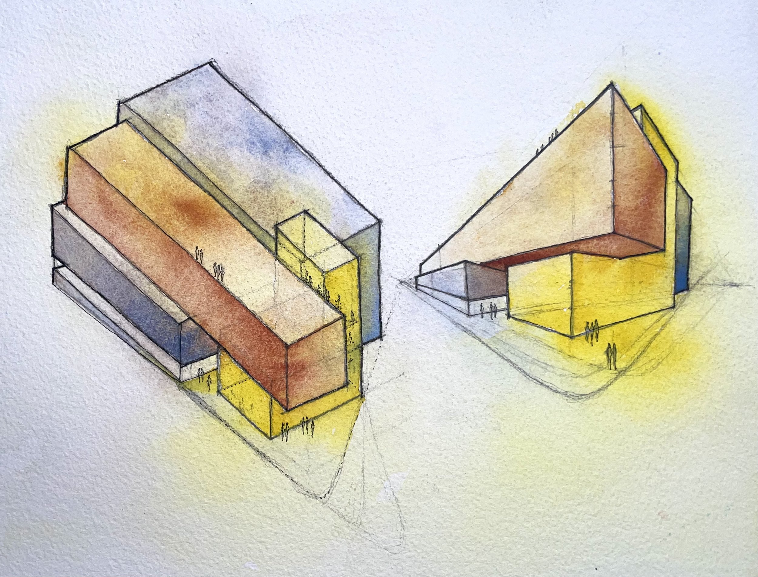
Below are additional watercolor sketches that have helped advance architectural design ideas. As opposed to applying a universal style or predetermined aesthetic, each sketch is a unique study based on the specific design idea being researched. Perhaps the same should be said of the buildings as well: rather than reflecting a universal style or predetermined aesthetic, each building reflects the research conducted during design conception.
Studies in integrated systems